
Bookbot

Nathan C. Yau

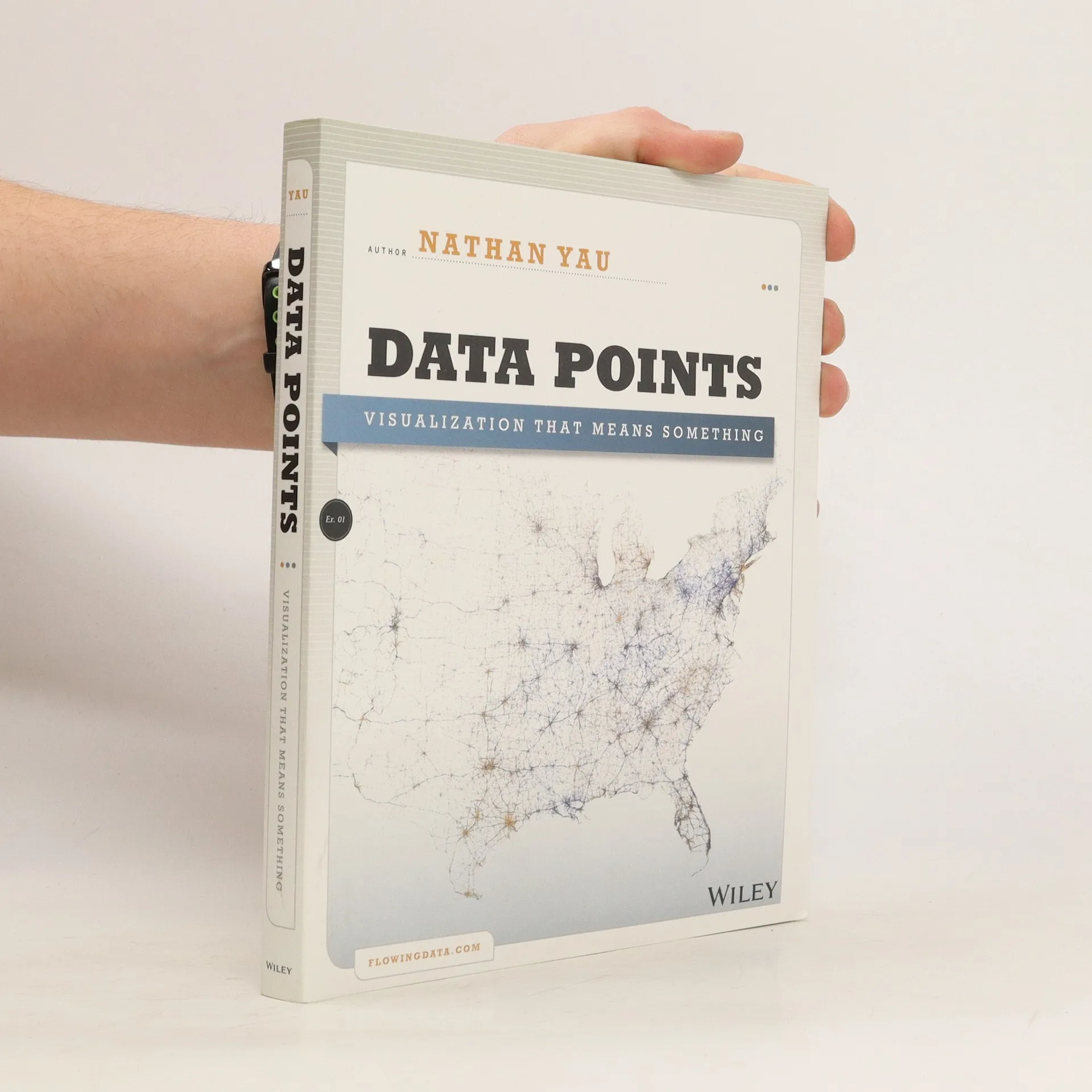
    Data Points: Visualization That Means Something
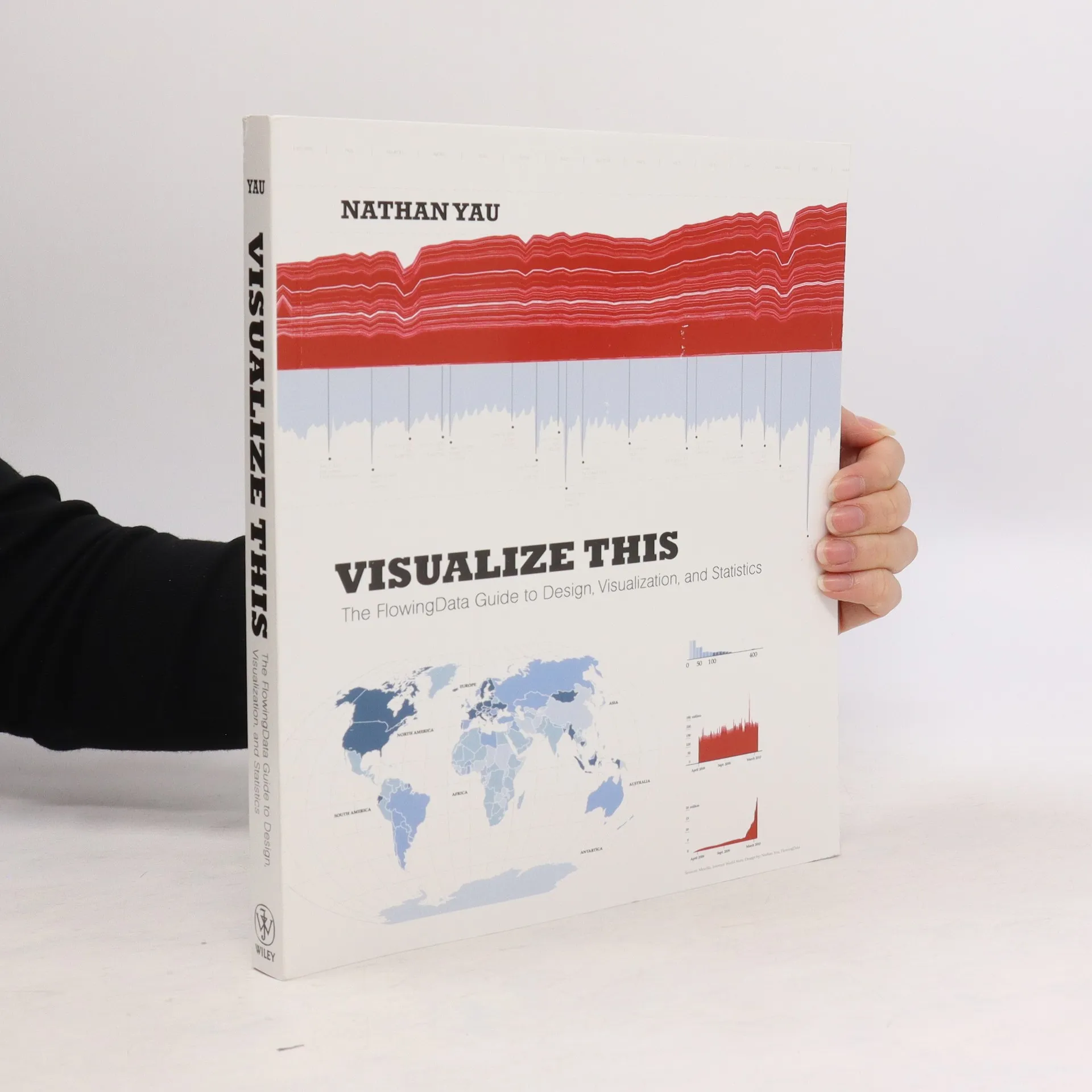
    Visualize this. The FlowingData guide to design, visualization, and statistics
    • Data is constantly increasing, making it challenging to organize in a way that resonates with its audience. Imagine visualizing data to maximize its potential and tell a clear, concise story. Thanks to Nathan Yau, a data visualization expert, this is possible. In this full-color guide, Yau provides step-by-step tutorials on how to visualize and narrate stories with data. He covers gathering, parsing, and formatting data, along with designing high-quality graphics that reveal patterns, outliers, and relationships. Yau offers a unique perspective on visualizing data, drawing from his expertise and the resources available at flowingdata.com. The book includes practical design tips for creating statistical graphics, geographical maps, and information design, helping readers find meaning in numbers. It details various tools for visualizing data-native graphics for the web, including ActionScript, Flash libraries, PHP, and JavaScript, as well as tools for print graphics like R and Illustrator. With numerous examples and descriptions of patterns and outliers, this guide demonstrates how to visually explain data, enabling you to present information in an accessible and engaging manner.

      Visualize this. The FlowingData guide to design, visualization, and statistics
      3,9
    • A fresh look at visualization from the author of Visualize This Whether it's statistical charts, geographic maps, or the snappy graphical statistics you see on your favorite news sites, the art of data graphics or visualization is fast becoming a movement of its own. In Data Points: Visualization That Means Something, author Nathan Yau presents an intriguing complement to his bestseller Visualize This, this time focusing on the graphics side of data analysis. Using examples from art, design, business, statistics, cartography, and online media, he explores both standard-and not so standard-concepts and ideas about illustrating data. Shares intriguing ideas from Nathan Yau, author of Visualize This and creator of flowingdata.com, with over 66,000 subscribers Focuses on visualization, data graphics that help viewers see trends and patterns they might not otherwise see in a table Includes examples from the author's own illustrations, as well as from professionals in statistics, art, design, business, computer science, cartography, and more Examines standard rules across all visualization applications, then explores when and where you can break those rules Create visualizations that register at all levels, with Data Points: Visualization That Means Something.

      Data Points: Visualization That Means Something
      3,8