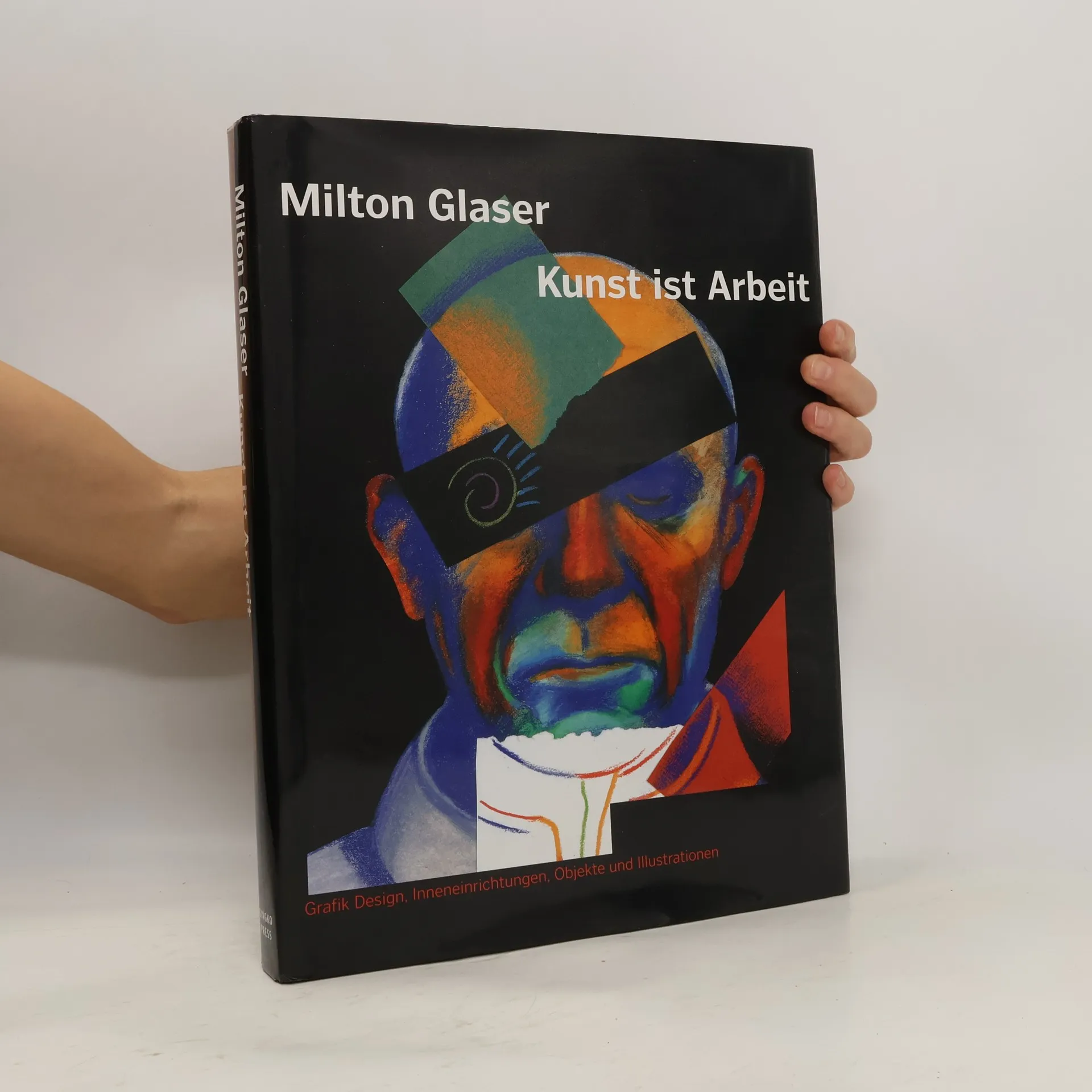
Kunst ist Arbeit
- 272 Seiten
- 10 Lesestunden

Milton Glaser war ein gefeierter amerikanischer Grafikdesigner und Künstler, dessen Werk die visuelle Kultur maßgeblich beeinflusste. Seine ikonischen Designs, darunter das „I ❤ NY“-Logo und das Bob-Dylan-Poster, zeugen von seiner Fähigkeit, unvergessliche Bilder mit großer Wirkung zu schaffen. Glasers Arbeit zeichnet sich durch spielerische Eleganz und visuelle Intelligenz aus, die oft die Verbindung zwischen Kunst, Design und Gesellschaft erforscht. Mit seinem Werk, das über Generationen hinweg Anklang findet, hinterließ Glaser einen unauslöschlichen Eindruck in der Grafikdesign- und Kunstwelt.

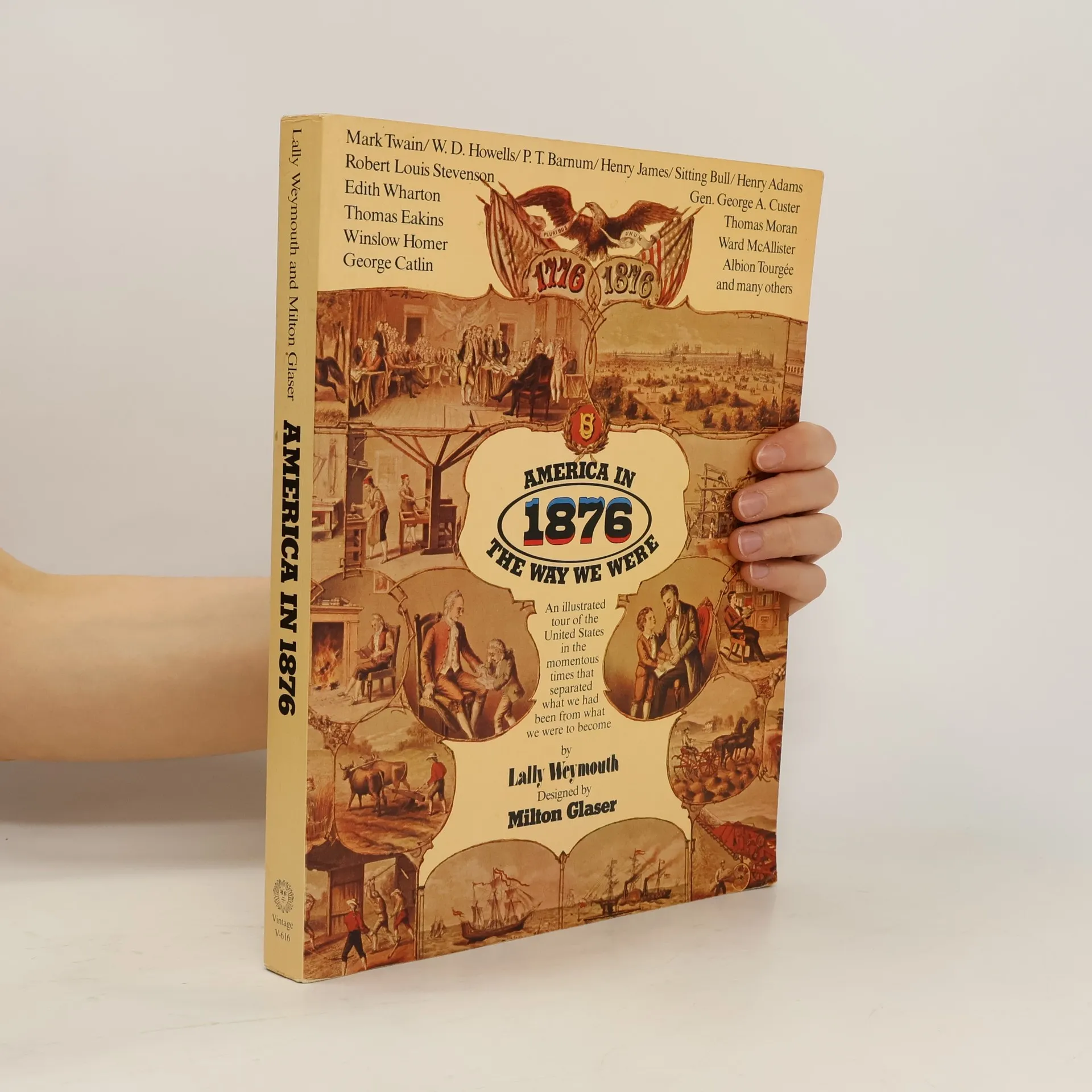
AN ILLUSTRATED TOUR OF THE U.S. IN THE MOMENTOUS TIMES THAT SEPARATED WHAT WE HAD BEEN FROM WHAT WE WERE TO BECOME.
The late designer Milton Glaser once said, "The most overused word, creativity, should in fact be described as discovery." This revealing peek inside Glaser's never-before-published journals offers uncommon insight into his design process. Through notes, drawings, and sketches from his home in New York City and his travels throughout Italy, France, and Spain, Glaser inspires the reader to find meaning in even the smallest details: a cat, a stage set, a portrait, a building--all aresignificant. "The joyfulness of art is discovering the connections themselves," Glaser wrote. A brief introduction by Glaser and an interview conducted by Jeremy Elias, originally printed in theNew York Times, are included.
"Design legend Milton Glaser demystifies his creative process in this thoughtful collection of illustrations showing his journey from sketch to finish. Glaser is a truly multidisciplinary designer working in exhibition, interior, and product designs. 'Sketch and Finish' features a variety of projects, from little known to iconic, including the logo. Glaser writes, "The tentativeness in the act of sketching is crucial. Doubt is essential. If you already know the answer before you start, why bother? Conviction is the killer of imagination." He illuminates the crux of each work with grace and a timeless mastery of craft."--Provided by publisher.
A global collection of socially and politically driven graphics that voice dissent, challenge status quo, and speak truth to power, curated by Milton Glaser, the dean of American graphic designers, and Mirko Ilic, a leading illustrator and art director.
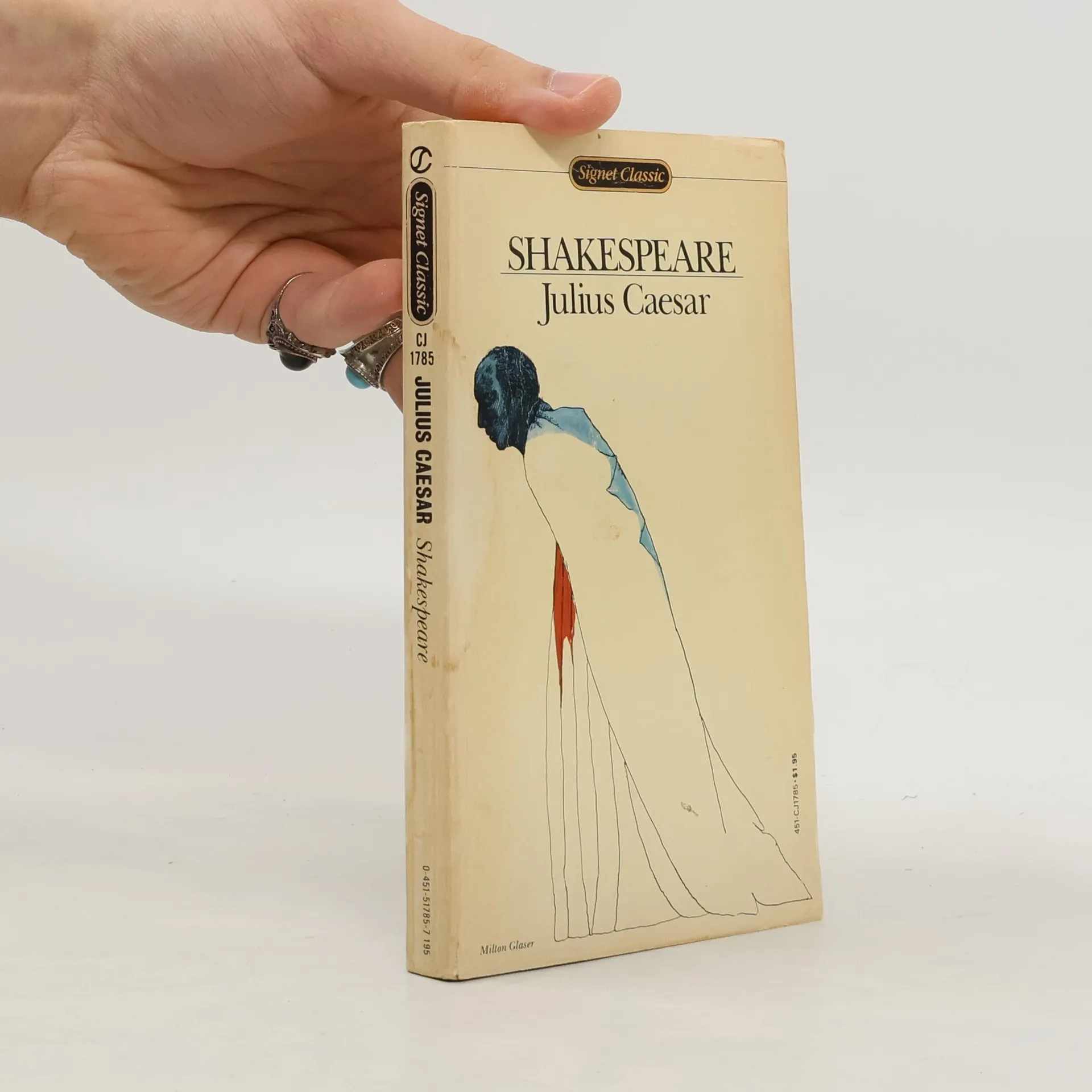
"The First Folio of 1623 is the definitive edition of Shakespeare's plays. It is more often than not the closest we can now get to what Shakespeare actually wrote. But the Folio's antiquated typography and cramped layout make it remote and inaccessible to modern eyes. The Shakespeare Folios on the other hand offer easy access directly to the First Folio by presenting the text in modern type but otherwise unchanged. All the First Folio's idiosyncrasies of layout and spelling, even its obvious errors, have been scrupulously left intact, but the text suddenly becomes as easily legible as the script of any modern play." "As an additional aid to understanding, readers will find, printed opposite each page of the Folio, the very same passage in a modern edition. So, whenever the Folio presents a problem, the reader can refer to this parallel text for a solution, either in the text itself or in the set of notes at the end of the book. These notes draw on the long tradition of Shakespearean scholarship and include full reference to surviving Quarto texts."--BOOK JACKET.
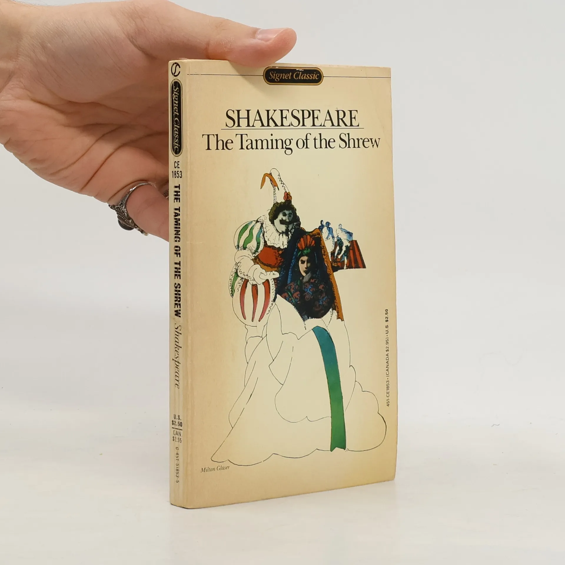
Shakespeare, who clearly preferred his women characters to his men (always excepting Falstaff and Hamlet), enlarges the human from the start, by subtly suggesting that women have the truer sense of reality.
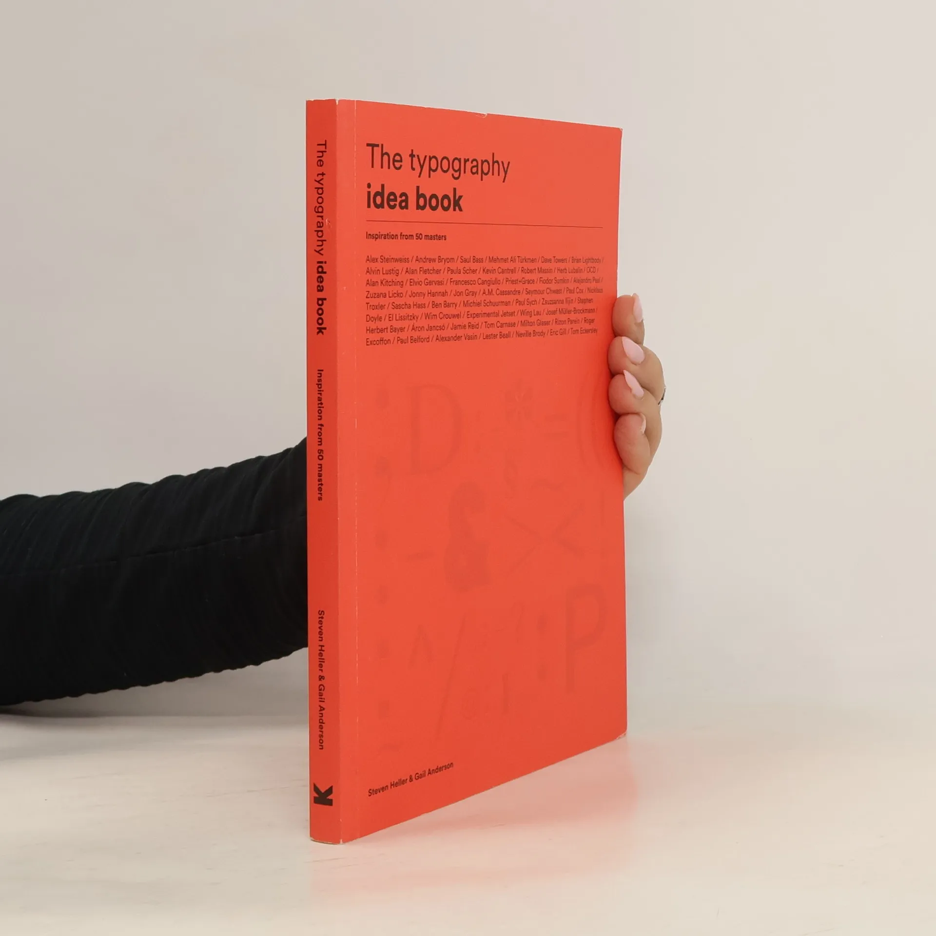
This book serves as an introduction to the key elements of good typographic design. Broken into sections covering the fundamentals of typography, the book features inspiring works by acclaimed typographic designers from across the world. Each section illustrates technical points and encourages readers to try out new ideas of their own. The subjects covered include typographic rebus, abstract form, overlapping, using grids, metaphoric construction and illumination. The result is an instantly accessible, jargon-free guide to typographic design using professional techniques